Designing for podcasts across platforms
Designing for podcasts across platforms
At Acast I lead the design for the podcast listener experience. With every project I aim to create a consistent experience across devices.
Here are a few of those projects.
At Acast I lead the design for the podcast listener experience. With every project I aim to create a consistent experience across devices.
Here are a few of those projects.
A consistent experience
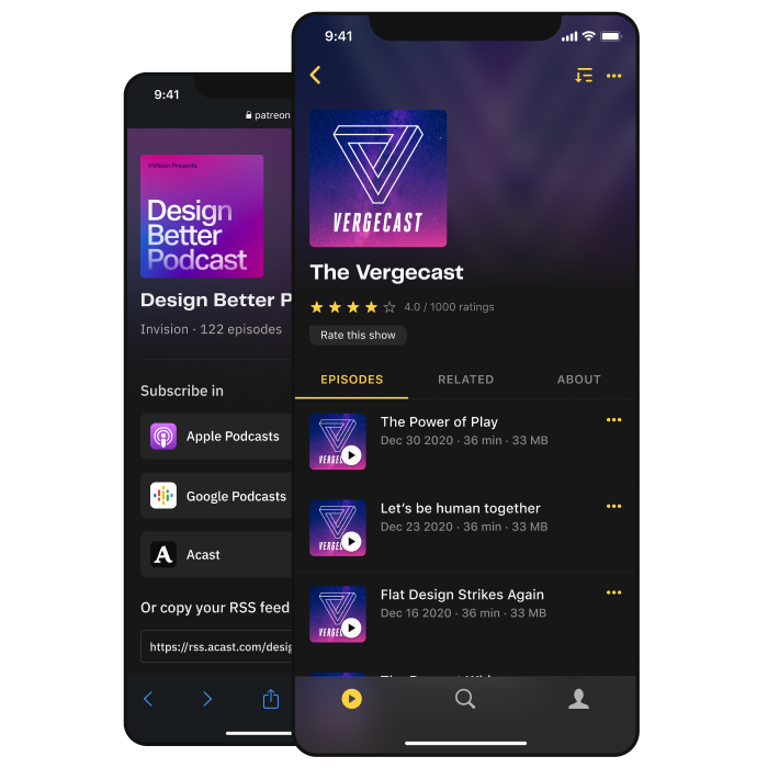
With many different products developed throughout the years I aim to create a consistent listener experience across devices.
By going content first I choose to promote artworks by using them blurred and darkened in other parts of the UI. The goal was to let the artwork's multiple colors and shapes shine, while still maintaining legibility.
With many different products developed throughout the years I aim to create a consistent listener theme across devices.
By going content first I choose to promote artworks by using them as blurred and darkened backgrounds. In comparison to single-color extractions, this would promote multiple colors and shapes like in the iOS app's player view.
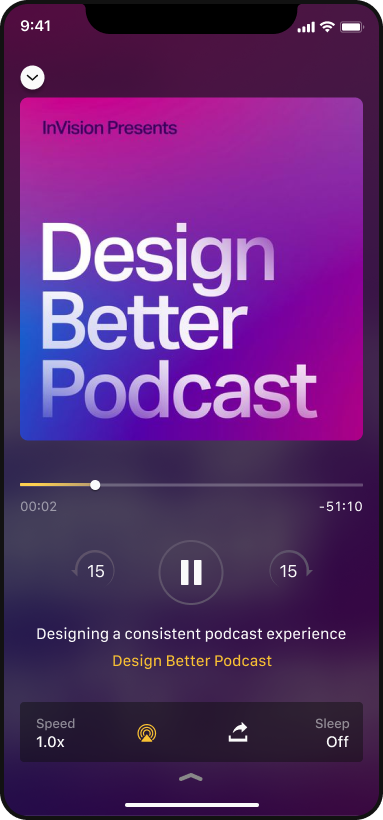
Basing the theme around blurred background artworks.
Basing the theme around blurred background artworks.
App ratings
As part of an app ratings project to increase content recommendations for users and listener feedback for creators, I saw an opportunity to redesign the podcast pages.
The left aligned content and slightly right-offset background image aimed to create a balanced mirror effect.
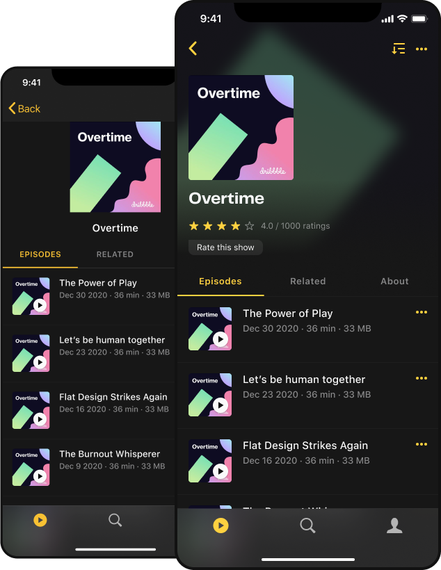
Old design to the left, new to the right.
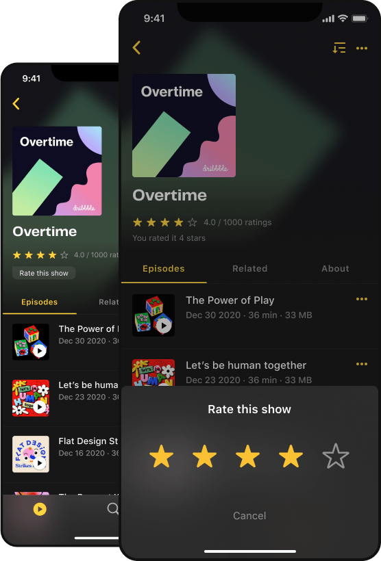
Accessible tap targets for star ratings.
Patreon subscriber web flow
Through an integration, Acast enables Patreon creators to set up subscriptions and access analytics. I redesigned the subscription flow through Acast.
The design was made to feel consistent to the Acast listener experience, bridging the app and web products.
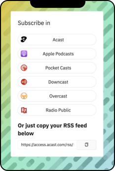
Old design.
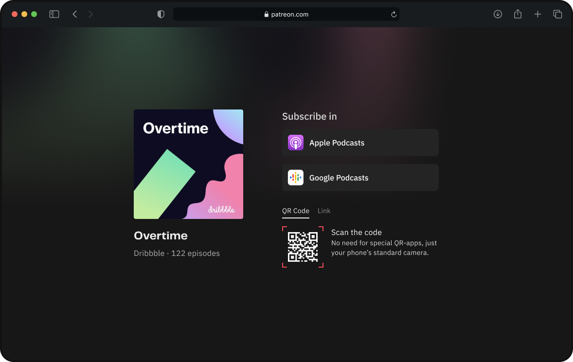
New design for desktop with QR code for mobile access.
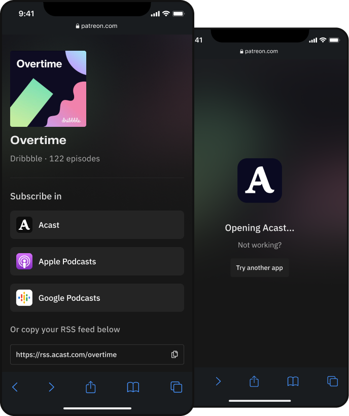
New design on mobile with direct app buttons.
Social media snipper tool
The Snipper tool enables creators to share short segments of audio and transcript on social media.
I updated the design assets, fonts, and increased legibility with background blur and text contrasts.
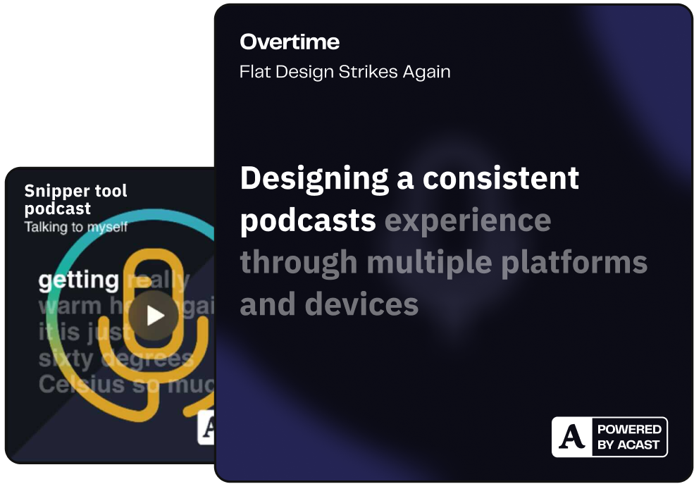
Old design to the left, new to the right.
Next up
I'm continuously working with the embed player, podcast pages and play website.
Browse more work
